For those who read my blog post often, you would probably stumble across my post titled “My First Attempt In Designing 2D Graphics”. For those who haven’t you can read it here. It is somehow good/important for you to read that post before you proceed in reading this post because it’s somehow related or indirectly related (at least you can see my progress in what I’m about to blog).
Few weeks after My First Attempt In Designing 2D Graphics, my lecturer gave us another project to be completed. The question for that project was “Dengan menggunakan pustaka grafik Java2D, tuliskan suatu aplet yang memaparkan lukisan grafik yang menarik”. So we were required to create interesting graphic using all the things that we had learned in class.
Our lecturer showed us a few examples of what our senior had done few years back to explain in detail what she meant by the word “Interesting”. These were the pictures she showed to us.

This is a Mascot for Java

A boat sailing on sea

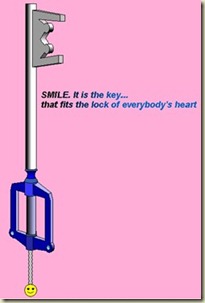
The design of this key is nice. It looked like a real 3D key because of the angle of the key and the colour gradient used. Impressive.
When the lecturer showed us this Gundam RX-178 Titan design, the whole class (me included) response was “Wow!!”. This design is much more complicated than the previous one that we saw. After seeing this design, in my heart I feel that this project is going to be tough. I thought this Gundam RX-178 Titan picture would be the last picture that the lecturer was going to show us. But I was wrong. She showed us this…

This time, the whole class erupted with voices saying things like “WAH LIOW EH!”, “GENG AH!”, “YENG AH!” and “SO DIFFICULT AH”! The first thing that came out from my mouth after seeing this Dark Angel design was “W*F!!!”. This design is superb.
**(The five photos above are for illustration purpose only. All credits goes back to the owner who design it)**
I began to worried about what graphic design should I create. Keep thinking about it everywhere I went. I kept searching for a suitable graphic on the internet. Kept searching it when I’m free or thinking about it. And finally, I bumped into this picture that caught my attention.

I liked this picture (Owl Clock) because it’s cute and colourful (don’t you think so?). As usual, I would think of many ways to make my coding process easier. So, I finally decided to do something extra ordinary. I photostated the Owl Clock on a piece of Over-Head Projector (OHP) paper which cost me RM2.50.
And I stole took 1 graph paper from my friend who was kind enough to sponsor me. Thank you Ah Fang^2.

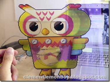
So after putting those two paper (OHP + graph) together, this was how it looked like.
I had this idea way back in my 1st graphic design assignment where I would activate the Gridlines function in Microsoft Paint which would make my eyes pain if I stare on the monitor too long. But this time, I did something different. I made it tangible. Now I could hold it, feel it, draw on it, count it and stare at it without making my eyes pain.
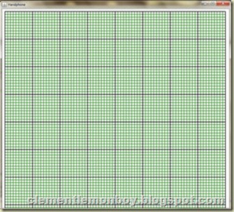
For those who know me, you know that I’m a irritating fussy person when it comes to graphic designing. Everything must be the same. The size, the coordinate and the colours must be exactly the same like the original picture. Yes, I admit that I’m all of the above because combining the photostated graphic with the graph paper was not enough for me. I was not satisfied. I want something more (greedy). So I did some calculation and some coding. And I created gridlines in my Applet and it looked something like this..

Now do you still agree with my friends that I’m a fussy person? I hope not :-). So with the physical grid behind the OHP and coded grid in my Applet, I can be rest assured that the coordinate placement and measurement will be similar to the original picture.
It took me roughly about 11 hours (3 days period) in total to complete coding all the outlines of this Owl Clock.

To be honest, starring at the grids in the Applet for 11hours in total was not a pleasing moment for my eyes. It really gave me a headache and my eyes were hurting every time I’m doing this project. What pushes me forward to continue coding this graphic was my interest and the end result. If it wasn’t for those 2, I would have given up long ago.

That was how it looked like without those grids at the back of the graphic. Although it looked a bit messy with all those lines/shapes overlapping each other (nose with the left eye), but I can assure you that it’s not after I started applying colours to all the shapes and objects.

I made some tweak to the colour(gradient) of the Owl Clock to make it look a little “3D”. If you are observant enough, you would probably realise that the feet of this Owl Clock is no where to be seen..haha. Not enough space, what to do? :-)
So I finally submitted my project to my lecturer yesterday. It’s a relief after submitting it. I hope that I can get flying colours for it ^_^.


.jpg)
6 comments:
wau....so cute!!
thx seanna :)
Impressive. Yours the best so far compare to other.
thx gca. appreciate that. just doing my best :)
wa!!! so cool...btw thanks for drop by at my blog.
nebular: thanks for the compliment. :)
Post a Comment